
HiMoA
Helping individual visitors be more engaged during their visit to the High Museum of Art in Atlanta
Project Overview
Team: Avery Ao, Holly Sun, Abhinav Thukral, Catherine Yang
Methods: Survey, Contextual Inquiry, Semi-structured Interview, Affinity Diagram, Comparative Analysis, Personas, Empathy Map, Storyboarding, Brainstorming, Prototyping, Heuristic Evaluation
Duration: 4 Months, Aug 2021 - Dec 2021
My Role: UX Researcher, UX Designer
Problem
Visitors to the High Museum of Art in Atlanta complained about having difficulties understanding the art and being bored during the visit.
Problem Statement
How might we help individual visitors (aged between 18-34 years) without relevant art backgrounds to be more engaged in their visiting experience at the High Museum of Art?
Solution
We designed a mobile app that would provide more information with higher accessibility about the collections of artwork and encourage more entertaining interactions between visitors within the museum.
Product Overview
UI by Abhinav Thukral
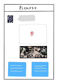
Feature 1: Information tags
After using AR technology to scan and recognize the artwork, visitors will be able to access two types of detailed information about the artwork.
Feature 3: Bookmark the artwork
Visitors are able to save or archive the artwork by tapping on the bookmark button and can get back to the bookmarked pieces of artwork for future reference.
Feature 2: Comments and reactions
Visitors can leave their comments on the artwork and they can see how others' thoughts as well. They can also just react to the artwork with a simple emoji.
Feature 4: Share an artwork
Visitors can create and share a postcard directly or share a bookmark of an artwork. Both will be in the form of an image with QR code(s) on it.
User Research
Highlights
We started out with a survey to collect quantitative data to get a general overview of our user groups, including topics like "who are our users?", "what are our users' needs?", etc.
I followed one of our target users visiting the High. This contextual inquiry aimed to capture nuanced and painful moments of difficulties that happen in real-life experiences but users may not reflect in the survey and interview.
We identified 3 main needs of visitors in the High Museum: Knowledge, Socialization, and Documentation.
Research Process
From secondary research and quantitative data, we found that: 1) Visitors cannot fully enjoy their visit.
2) Due to the lack of art background, visitors find it hard to understand and want more information about the artwork in the High museum.
3) Visitors mostly are by themselves, so they sometimes feel bored and need more socialization during their visit.

During our deeper qualitative analysis, we identified reasons behind this pain points:
Then, in the contextual inquiry where we followed our user, I observed that: 4) Most visitors frequently use their phones to document their visit but were having trouble getting back to it.
Click to see more details of the research process
Decision: In the case that most visitors are using their phones a lot, we decided to explore our solutions on the platform of a mobile app.
Personas & Empathy Maps
I observed that our target users are made up of three primary categories with different combinations of the 3 main needs above. We then moved on to create representative personas based on our research insights. We explored their feelings, needs, and pain points with the assistance of empathy maps to identify design opportunities.
Click to see the three personas and empathy maps
User Goals
I realized that, the inability to fully enjoy their visit to the High museum was primarily because their needs are not fully met by what is currently available and their experiences are not accessible enough for later reflection. To better inform our later design, I developed our user goals based on the current needs.
PAIN POINT
Visitors do not have enough information of the art.
GOAL
Knowledge
Provide access to additional information on artworks for better understanding.
Individual visitors lack opportunities to express their ideas and want to know others' interpretations of the art.
Visitors frequently take out their phones to document their experiences, which is a potential interruption of their visit, and the documented media is usually hard to retrieve.
Socialization
Offer space for communication and sharing of ideas and thoughts
Documentation
Enable smooth documentations and easy-to-find collections of documented records
Storyboard
I developed a storyboard that puts one of our personas into the journey and displays possible points where the user goals can be observed and design opportunities can be explored.

*Drawn by Abhinav Thukral
After our user research, we have identified our primary users, specific problem statement, and user goals.
Users
Characteristics
Individual
Age: 18 - 34
Without enough art background
Justification
From our survey, most of our target users visit by themselves.
1) Based on our observation and the museum's report, people from this age range are the majority of the High museum's visitors.
2) People from this age range are tech savvy and will benefit from our digital solution.
From our survey and interview, this characteristic leads to most of the visitors' not being able to fully engage in their visit.
Problem Statement
How Might We
Develop a mobile app that helps
individual visitors at the age of 18 - 34 without enough art background
be more engaged in their visit to the High museum
by offering knowledge, socialization, and documentation functions
Justification
As mobile is widely and frequently used in the High museum, an app would be the most appropriate platform for our solution.
Our primary user group identified after user research.
Not being able to fully enjoy the visit is the main complaint visitors express in their comments on the High museum
User goals identified in our user research
Develop and Ideate
After figuring out our users' needs and current issues that are bothering them, we first worked on exploring design opportunities, generating design concepts, and creating initial wireframes. We then went to do feedback sessions about our ideas and wireframes and improve our design based on collected data.

Brainstorm
We walked through the visit journey, evaluated user needs, identified design implications, and generated concepts.

Collecting all the pieces of ideas, we connected the ones that are related and formed 4 main ideas.
Sketches
To quickly visualize and test the feasibility of our design with minimum cost, the team drew the main ideas that we have for meeting the user goals.

AR Scanning & Information
Knowledge

Comments
Socialization
Chatbot
Knowledge

Postcard
Socialization, Documentation
Concept Testing & Evaluation
Before moving on to develop wireframes, the team conducted quick tests by presenting the sketches to 3 participants so we can collect feedback that helps inform our future design direction.
Concept 1: AR Scanning & Information - Knowledge
Scan the artwork and display information in the pins.
Pro
Point-to-point information allows users to learn information in the context and form a better connection between information and related part of the artwork.
Con
It may not be too intuitive for users to understand how to interact with it.
If there is too much information, the interface will be hard to read through.
Why we chose it
Though the interaction might be hard to get at the first time, since our users are tech savvy, it might not be a large barrier to them as compared to how much more helpful information it could provide.
Planned improvement
Organize the information to remain clear and categorize information to make it simple for users to walk through.
Concept 2: Comment - Socialization
Comment the artwork to communicate ideas
Pro
Being able to see all-time comments by other previous or current visitors brings more entertainment to users to help engage in more.
Con
There might be irrelevant comments that interrupt with the experience.
Why we chose it
It is a form of socialization that users have the freedom to choose to use or not. The content could be moderated to avoid potential interruption while still providing a space for users to exchange thoughts.
Planned improvement
Display the comments based on relevance.
Concept 3: Chatbot - Knowledge + Socialization
Chatbot as a companion to share knowledge and ideas
Pro
Combine knowledge and socialization to form a smooth flow that does not interrupt users visit.
Con
It is hard for users to get the chatbot about who they are talking to and what they can get from the conversation.
Why we did NOT chose it
It seems to be an outsider that can develop as an independent product as the rest of the three ideas can be combined. At the same time, this idea needs more contextual information and storytelling to introduce visitors to this product when users may not have the time or patience to do so.
Concept 4: Postcard - Socialization + Documentation
Create their customized postcard documenting their visits with images and words.
Pro
Exclusive space for users to create their customized notes as documentation which can be easily retrieved in the future.
Con
Too much customization brings barriers to users when they are creating the documentation.
Why we chose it
It can also prompt users to reflect on their experience, which may then lead to further learning from users' visits and strengthen the connection between users, memories from the visits, and the products, bringing positive emotions.
Planned improvement
Balance the level of customization by offering different layout to users.
Design Decision
Because the Chatbot idea is independent of the aspect of storytelling and context compared to the rest of other three ideas; for example, it is a communication between the product and the users while the rest of the three are more like one-way communication, we decided to move forward with AR scanning (Knowledge), Comment (Socialization), and Postcards (Documentation).
Wireframes
We added in more details to our initial sketches to build low-fi wireframes and tested the workflow to see how the combination of ideas works.

Information Tags

Detailed Information

Comments

Bookmark

Create Postcards

Edit Postcards
Testing and Feedback Session Findings
FINDINGS
Users are having deviated assumptions about how they can interact with the information pins to expand to see more information.
Users cannot understand some of the labels and buttons since words are used repetitively but refer to different functions in the system.
Overall, users faced difficulties in navigating through the experience initially due to a lack of cues about the interfaces' affordance.
DESIGN IMPLICATION
Additional feedback on system status is needed to inform users on how to interact with features.
The language and UX content used in the design should be more descriptive and direct.
An onboarding tutorial is necessary to help first-time users understand and get familiar with complex interactions.
Design and Iterate
As we settled down on our design via the wireframes, we continued to develop the prototype. During this stage, we conducted 3 rounds of expert testing and 5 rounds of user testing to collect feedback about our prototype and we were also improving the prototype between tests. After ideation, we settled down on our application with 4 main features and completed the prototype.

Product Main Features
FEATURE 1
GOAL
AR scan artwork & Display Information
Provide helpful and structured knowledge
DESIGN DECISION
Offer both information tags (for specific information) and a detailed page (for overall general information)

Information Tags

Point to Point Information

General Background
Originally we are only designing the information tags to display all the information about the artwork. However, during sketch testing, users expressed concerns about having too many information tags on the screen. Therefore, I suggested we display the general information on a detailed information page that will display when users swipe up while the information tags only hold details that are explaining the specific part of the artwork.
CHALLENGE
Information tags are not intuitive enough for users.

Original design

Explore alternative design

Current prototype

Iteration after user testing
When we are considering the appearance of the information tags, it is challenging to figure out a solution that is both visually appealing and easy to understand. We started the design by focusing more on conveying direct affordance so we added numbers on the information tags to imply users follow the order to read. We also explored alternative designs where icons are used. The original design is easy to understand but users are confused by the order -- they think the order should be meaningful when it is not. The alternative design is not inviting enough for users to tap on it.
So we remain with the original design and remove the number. After our user testing as users can understand the interaction, I suggested that we can improve it further by increasing the difference between the two circles so it is more clear and adding more animated effects that indicate these circles are tappable.
ITERATION

Original scan page

Added Recently Viewed after user testing
After the first round of user testing and heuristic evaluation, we noticed the fact that our users are worried about accidentally closing the information of the artwork and not being able to get it back.
In order to help them recover from errors and avoid scanning again which wastes time, I added a "recently viewed" feature on the scanning page to offer a direct path for users to go back to their most recently visited information page.
FEATURE 2
GOAL
Comment artwork
Create platform for socialization
DESIGN DECISION
Display comments in the form of real-time chat to increase the sense of live communication and companion.

Considering that our invidicual users felt bored due to lack of live socialization and companion, we chose to display the comments in bubbles which will be popping up as the users enter the comment page. This is inspired by the live streaming interface, and we hope this would build a sense that there is a conversation going on lively about the art and serves as a companion for the users.
ITERATION

Original Design

Improved After User Testing
To diversify the reactions users can make to the artwork, we also allowed emojis as a quick and easy option. We were trying to use animation to display the emojis so the page is dynamic to reduce boredness. However, during our user testing, our users were confused with the animation and cannot understand clearly the feature's goal. Therefore, in our iteration, we display the emojis statically and instead, enable animation as users react with emojis. So it still adds dynamic elements to the experience and remains clear to users.
FEATURE 3
GOAL
Bookmark Artwork
Enable documentation and retrieval
DESIGN DECISION
Allow users to bookmark the artwork they are interested in and save the information in the collection for later review.

Bookmark

Collection

Review Information

Revisit Notes
As users are having trouble puting the media related to their visit together and difficulties getting back to them, we proposed the bookmark feature that allows users to save the artwork they liked. The related information will be available for future references and the notes they recorded during that time will also be saved for reflection.
FEATURE 4
GOAL
Share Postcard
Create artifacts for socialization and documentation
DESIGN DECISION
Provide different layouts for users to customize their postcards and share to social media platform or download.

Create a postcard

Offer customizable layout

Share or download
Initially in our sketches testing, we allow users to completely customize the postcard so they can have full freedom in creating the artifacts. However, our users expressed their negative feedback due to excessive freedom. Full customization, to our users, means efforts and time spent during the creation and potential barriers for users whose goal is to share and document instead of create. Therefore, we provided several diverse predesigned layouts so users can create a relatively unique postcard that is good for sharing to other social platforms in a short time.
Summary
What I Learned
Accessibility & Universal Design
I learned how to increase the accessibility of my design and tried to reach the level of universal design.
Communication
I improved on how I deal with others' disagreements, how to express my ideas accurately, and how to defend design and ideas with valid reasoning.
Leadership & Confidence
I was way more confident to lead a session or be the one who speak for the whole team at the end of the project than at the beginning.
Where I Could Do Better
Improve the design
Though the semester ends, our team still plans to meet together to fix the issues in our design which we did not have time to do so.
Have a larger sample for feedback and testing
We would try to gather more participants to test our ideas and prototypes because the current number we have is still not adequate and we feel our findings lack reliability.
Participate more in visual design
Our visual design of the prototype was done largely by our team member Abhinav Thukral. I wish I could participate more in the visual design section. I am doing a redesign of this project and will update my own work here when it gets ready.